This is an assignment I was really excited for. I have perused the tabloids at the grocery store for years. Working at a grocery store, I had plenty of time to memorize and study the layouts and special design characteristics the leading magazines used.
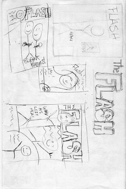
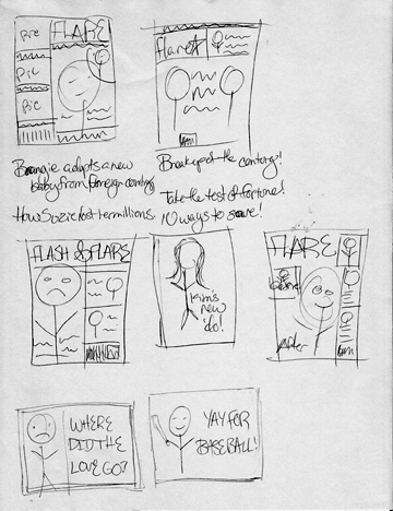
As always, we begin with sketches and planning.


After I chose the layout I liked the most, I began collecting stock photos. 


Portrait of two gay men


Family sitting in front of house, smiling

Pregnant woman on beach
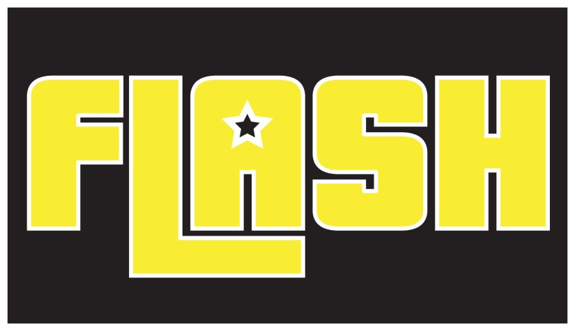
After observing other tabloid magazine covers, the aesthetic I took away was a dark frame with, vibrant, primary colors.
The star in the A of the logo came after playing around with sketches. The original typeface used is called Pricedown. The star was found in the Symbols tab and I manipulated it into the A.